<img>と<md-card>をangular Materialで応答可能にする方法は?
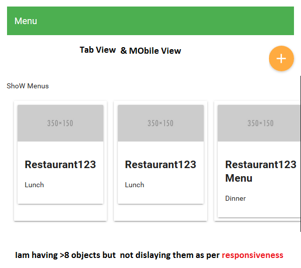
<md-card>および<image>タグでループして動的コンテンツを表示しています。出力がタブレットまたはモバイル画面で応答せず、次の行ではなくスクロールバーが表示されます。私のコードの何が問題になっていて、どうすればそれを応答可能にできますか?
<p>Show Menus</p>
<div layout="row" layout-margin >
  <md-card  ng-repeat="menu in sampleMenus">
   <md-card>
   <img src="http://placehold.it/350x150" class="md-card-image" alt="image caption"/>
    <md-card-content >
     <h2>{{menu.displayName}}</h2>
     <p>{{menu.type}}</p>
    </md-card-content>
       </md-card >
  </md-card>
</div>
スクリーンショット: 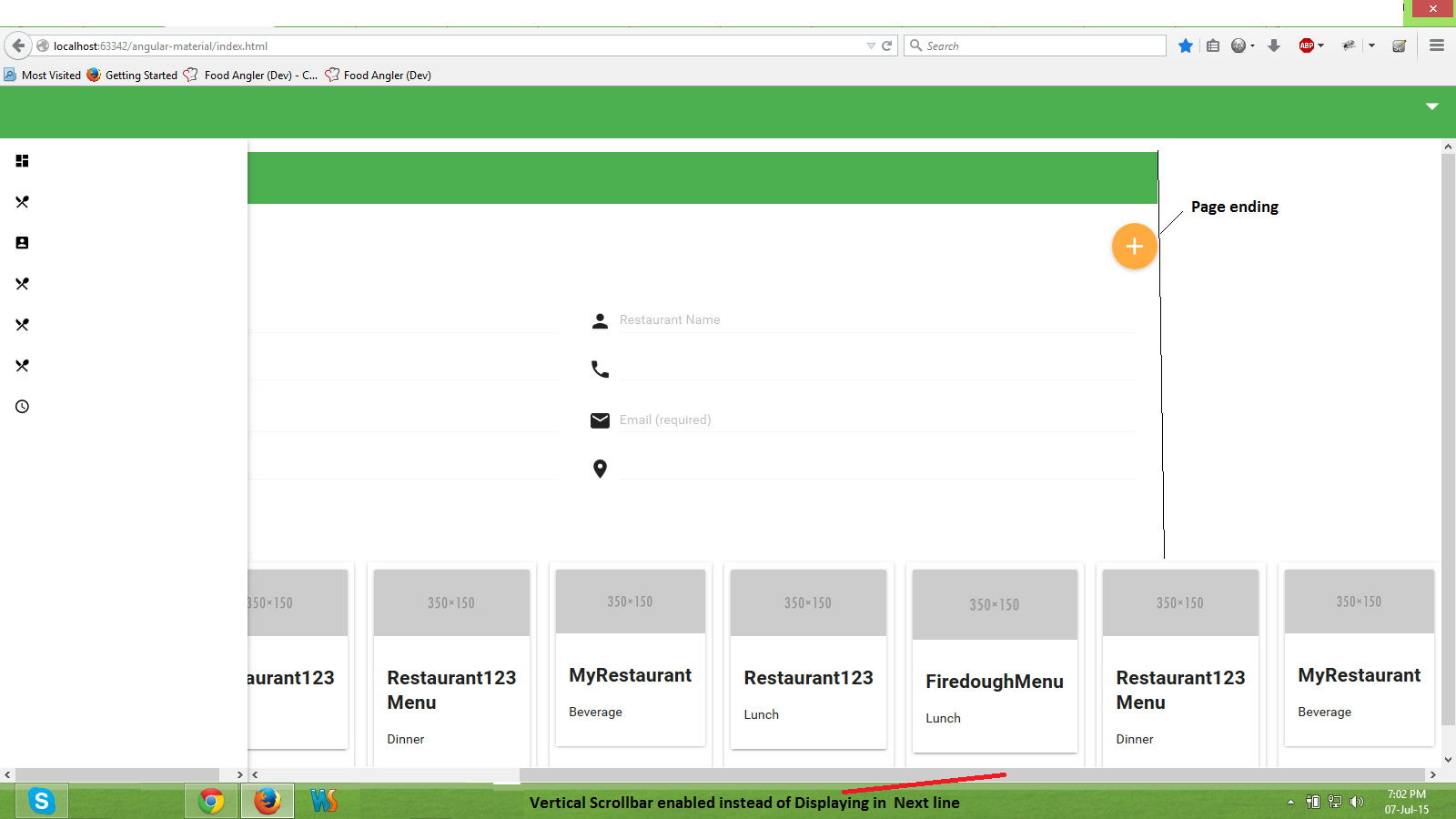
これはあなたの大義を助けるかもしれません。
http://codepen.io/sstorie/pen/myJWxQ キーは、親に追加された2つのクラスと各カードのimgです
.parent {
  overflow: hidden;
}

.card img {
  width: 100%;
  height: auto;
}
Flex(行の幅、列の高さ)属性を使用して、md-cardサイズとレイアウトラップを親コンテナで宣言できます。 Layout-alignはあなたの原因にも役立つかもしれません。
<div layout="row" layout-margin layout-wrap layout-align="center center">
     <md-card flex="25"> //25% of parent
                //content
     </md-card>
</div>
その他のオプションについては、ドキュメントをご覧ください。